What is the year of the Yang Wood Dragon bringing us?
The Year of the Wood Dragon happens once every 60 years. The last time was in 1964 and the next one will be in 2084. The previous Dragon year was 2012 (Water
Home » Blog » Press & Media » Boost your home’s curb appeal this weekend with a D.I.Y. pop of color
The original article was published in LA Times:
Homeowners looking for major impact with minimum effort often overlook the easiest solution: the front door.
While white, gray and brown remain go-to colors for the less adventurous, more exuberant hues are on trend for those who want their entry to provide an instant pop of personality to their home.
“The front door may very well be the first and last thing your visitors see up close, so it might as well be memorable and inspiring,” says interior designer Meg Braff, whose new book, “The Decorated Home,” is chock-full of her signature colorfully cheerful interiors. “For my own home, I chose an aqua lacquer — it brings me joy every time I turn into the driveway and see it shining in the distance.”
Los Angeles feng shui expert Francoise Courty-Dan says the color of your front door can be revealing.
“A bright, rich front door creates yang energy, which is active and male and is usually more appealing to younger people,” she says. “Softer, quieter colors create yin energy, which is more passive and female, and often appeals more to older people.”
When it comes to how certain hues look, Southern California has a distinct advantage to other locations.
“What happens here is that the light is really clear and strong, and even when it’s diffused, you can see the undertones,” says Farrow & Ball color consultant Erik Runner. “Saturated, rich tones really come out, both indoors and out, and colors that are complex change a lot from day to night.”
Start by assessing the other elements of your home’s exterior — the color of your roof, trim and walls, and the overall style.
“A brown brick Midcentury Modern house would look great with a quiet terra cotta, but you could also go with the kind of bright orange you’d see on an upholstered chair from that era,” Runner said. “A Spanish colonial with a red tile roof and white stucco exterior could take a deep, saturated color — even something more unexpected like teal would look wonderful.”
Braff also advises simply taking a look around your property before embarking on painting your front door.
“The color selection should never come from out of nowhere,” she says. “It should relate to something in the area, even if it’s the flowers in your garden. I often repeat the color from the garden bench or a garden gate entry. Repeating the color has a way of connecting the property in a subliminal way.”
If you’re still nervous about jazzing up your home’s entry with a vivid splash of color, Runner has some words of wisdom: “It’s a quart of paint,” and perhaps part of a weekend or two to plan and prep, and one to execute. “What could be easier than that?”

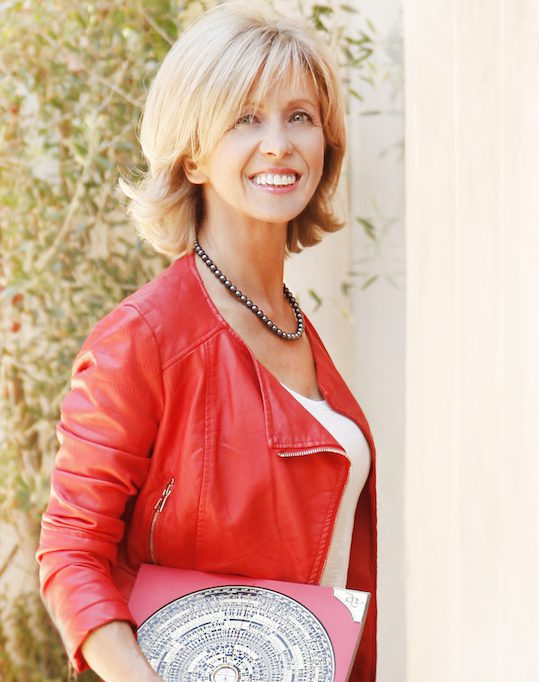
Francoise Courty-Dan is a Certified Classical Feng Shui consultant and a member of the International Feng Shui Guild. Over the years, she has helped a multitude of clients improve their wealth, health, career and relationships. She is the Founder of One World Feng Shui, a Los Angeles based consulting agency, available domestically and internationally for residential, commercial and corporate projects.
A dedicated Feng Shui master, she is enthusiastic about her mission to make the world a better place - one space at a time. An advocate of the power of the environment, she believes in balance and harmony and guides people live a happier, healthier and more inspired life.


ARE YOU READY TO GET THE BEST OUT OF YOUR LIFE?
Feng Shui helps you live in harmony and fulfill your goals and dreams, Find financial comfort, Enhance your career, Improve relationships and Attract romance, Feel energized and healthier.
Would you like to schedule your complementary evaluation?
The Year of the Wood Dragon happens once every 60 years. The last time was in 1964 and the next one will be in 2084. The previous Dragon year was 2012 (Water
Thanksgiving is the time when many of us reflect on what we are grateful for. I want to personally thank you for your many expressions of loyalty, trust,
Here’s to a bright New Year to you and your loved ones and to what 2023 has yet to offer us! Over the holidays, we,